In this article, we are going to talk about what’s new in Moodle Workplace 4.0, what updates have been made, new features of Moodle for Business, and improvements that have been made both in navigability and user experience (UX).
Let’s start from the beginning.
What is Moodle Workplace?
Although this tool can be applied in educational environments given its flexibility, Moodle Workplace is intended for corporate training, facilitating the incorporation into the workplace and/or learning environment.
In a previous article, we explained in more detail what Moodle Workplace is and how it works.
What’s new in the new version of Moodle Workplace?
Easy and intuitive navigation
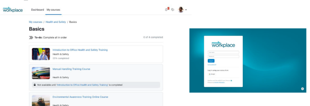
In line with the Moodle elearning platform in its new version 4.0, Workplace offers more intuitive navigation and UX improvements thanks to a new design with a fresher and more modern feel.
The side navigation has disappeared and the navigation is now horizontal, allowing the information to be centered in the central part of the screen.
New dashboard
Several versions have been made until reaching the final dashboard with the objective of improving learning with a personalized control panel.
In the new design the courses have been organized by configurable blocks, clearly distinguishing the courses in progress and the next courses that the student can take. This new organization allows greater accessibility to information, finding what the student is looking for in just a few clicks.
New design of the Login area
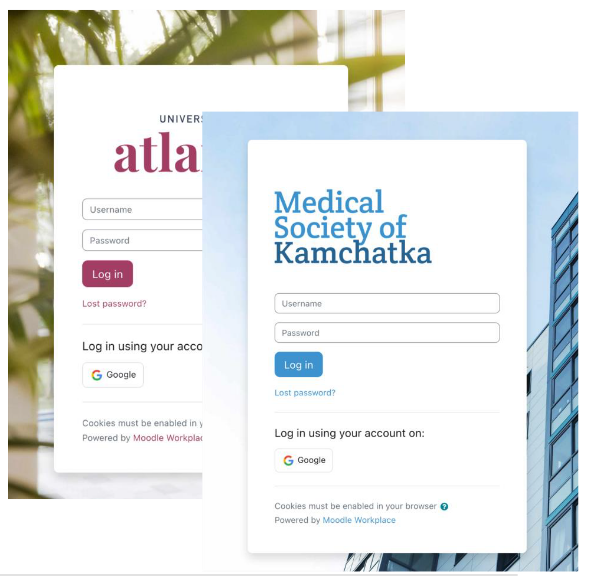
The authentication area has also been modified towards a clearer and more intuitive design.
It is customizable and can be adapted to the corporate image of the company, changing colors, background images and being fully compatible with multi-tenant.
Intuitive design on the “My Courses” page
This page summarizes all of the user’s learning, including the courses he/she is enrolled in, the courses available to that student, and the program. You can then quickly and easily see the learning backlog.
Search filters and a specific search box have been added for better accessibility.
Programs, change of the page structure
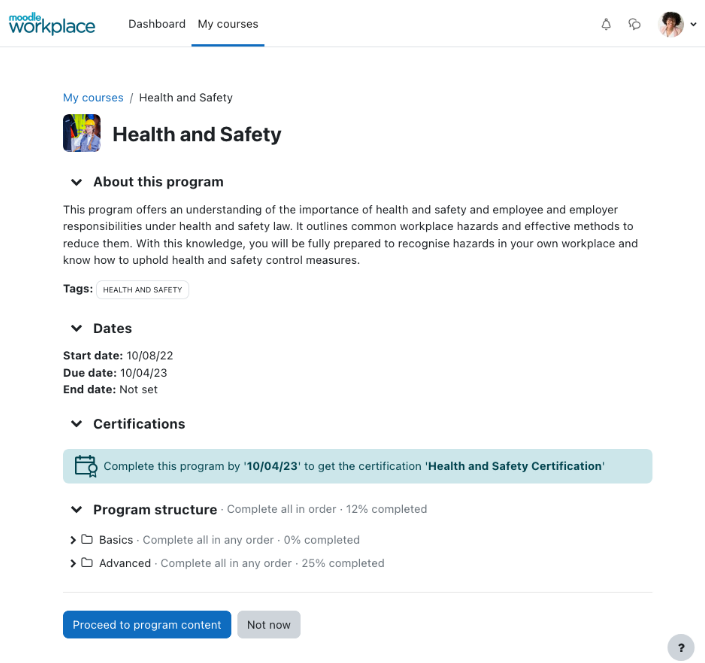
The interface has been redesigned so that each program has its own place in the learner’s workflow.
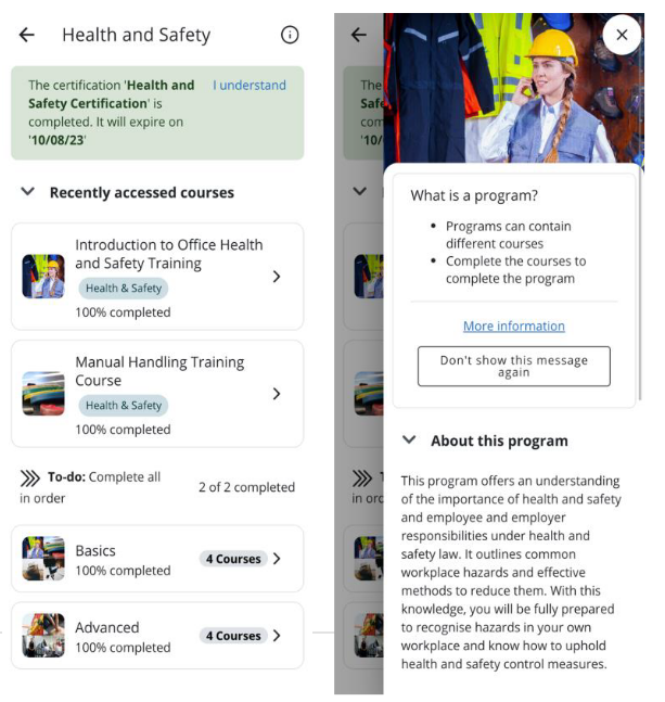
In the previous version of Moodle Workplace the programs and courses had the same page structure. In this new version, on the program page, we have complete information about this program, including which courses are included, dates, certifications, and the structure of the program itself.
The program is displayed in such an order that until one course is completed, the next course cannot be taken.
Customized pages
Custom pages are pages that administrators can create to provide users with additional information.
These pages are customized and blocks can be included to show them to different user audiences according to their needs.
A new block, reports, has been created where such reports can be displayed on those pages.
These pages can be displayed at the global site level or by a specific workspace with the option to reuse them.
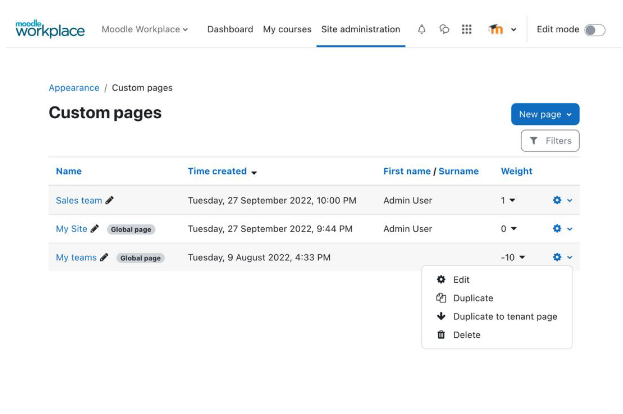
As we have mentioned, on these pages you can add blocks or create them as you did in the previous version of Moodle Workplace 3.11, in the dashboard area.
With the user audiences option, customized pages can be selected and targeted to specific user groups.
New My Teams page
What used to be the “my teams” tab is now a personalized page where the administrator can see at a glance all the team members, what is the role or profile of each member, their online learning process, the status of their courses, and certifications.
The view of one particular student has also been improved. In a clearer way, you can see the educational progress of that person, with start and end dates and, what is their educational process, etc.
Moodle App
In previous versions of Moodle Workplace, there was a branded Moodle app for each instance. The novelty is that you can now have a branded application for a specific tenant within a multi-tenant site. Perfect for multi-tenant sites.
You can also watch the recording of the webinar where Pau Plana (CEO of 3ipunt) gave us a walkthrough of the platform to explain the new features of the most important update of Moodle Workplace.
Moodle Workplace 4.0 conclusions
We have reviewed the main new features offered by the new version of Workplace with its new look and feel and improved user experience to facilitate online training of students and monitoring by managers or administrators.
Always moving forward in the Moodle community with the goal of creating quality education anywhere in the world. Moodle Workplace 4.1 will be available soon and we will inform you about it in the next few days.

