
In a corporate environment, training is almost never provided in isolation. There are induction programmes, compulsory courses, development programmes and certifications that expire, and all of this is grouped into training pathways that grow year on year. As the range of options piles up, what was once a clear path ends up looking like a mere list.
And to what extent is this a problem with the content, and to what extent is it a problem with how it looks on screen?
Much of it comes down to the latter. A well-designed learning path can be confusing if the interface fails to convey its structure, and that is where learners’ doubts lie: where to start, how much is left to do, and why there is content they cannot yet access.
That is why we have redesigned the way course groups are displayed in Moodle Workplace via the Fresk Suite. The change does not affect the settings of your programmes: it focuses on what the learner sees.
Why do students get lost along the way?
In corporate environments, training pathways often end up becoming complex structures, with nested levels that mean little when displayed on screen. The result is always much the same:
- The level cannot be distinguished. Groups within groups that look the same as the courses they contain.
- The scope of the programme is unknown. Whether it’s three years or fourteen, you keep at it until you get in.
- It is not known whether there is any order to it. The student cannot tell whether they are choosing freely or whether they must follow a sequence.
- A blockage is not understood. A course that cannot be accessed, with no indication as to why.
- There is no input context. You come to the programme without knowing what it is or who it is aimed at.
A hierarchy that can be understood at a glance
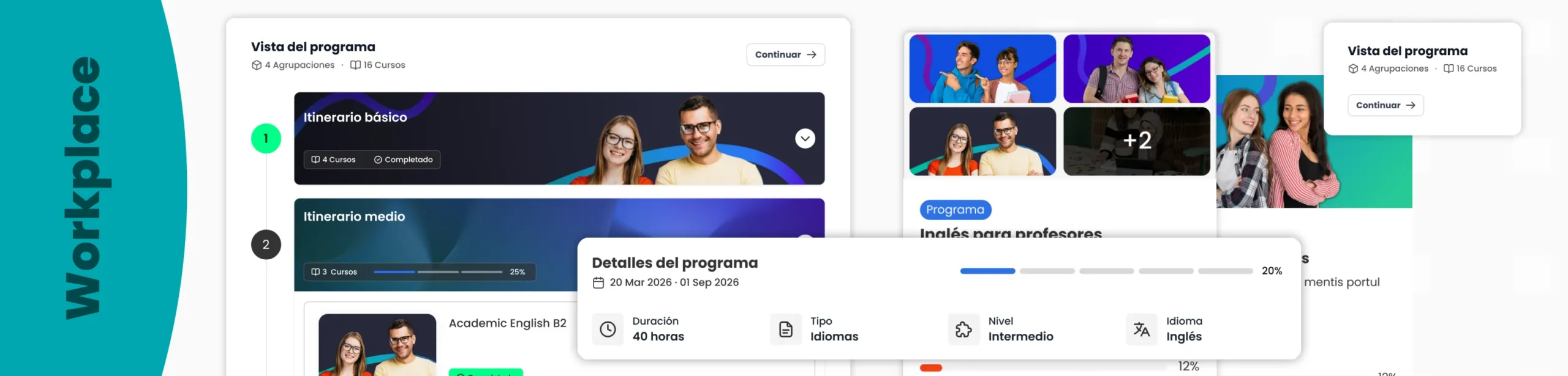
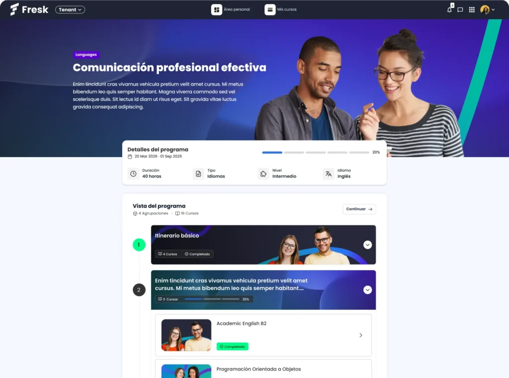
The first change concerns the visual hierarchy of the course groups, which has been completely redesigned. The levels, which used to be crammed together, are now displayed as a neat outline, making it clear at a glance what each one contains.
The approach has been twofold. On the one hand, to prioritise logical progression, so that the journey can be followed in the order that makes sense. On the other hand, to eliminate clutter: in a multi-level structure, visual clarity is not merely an aesthetic whim; it is what makes it legible.
Students can see at a glance how the content is organised, without having to open anything to find out.
A display board introducing the programme before you enter
The first screen of a training programme is quite decisive. If it doesn’t explain what it’s about, the learner either goes in blind or doesn’t bother at all.
To address this, we have introduced a banner at the top of the page that serves as an introduction to the itinerary, with the title, subtitle and key features all incorporated into a single space. This provides the context that previously had to be explained by email.
The cards for each itinerary now also display more information, starting with the detail that everyone looks for first: the total number of courses in the group. Knowing in advance the workload ahead changes the way a person organises themselves to tackle it.
Each itinerary is displayed according to how you have configured it
Here, for us, is the most interesting bit. The interface adapts to the type of configuration defined in the itinerary, so that the screen reflects the rules you have already set. If the route is open-ended and the learner decides which way to go, they see it one way; if it is sequential and they must complete one step before moving on to the next, they see it another way. There’s no need to read the instructions to know which of the two cases applies.
The status of the content is also displayed much more clearly. Courses that are locked or have outstanding requirements are marked with specific indicators, so the availability of the material is no longer something you have to work out for yourself or ask about.
It is a small difference in appearance but a significant one in practice: the student works out their own approach without anyone having to explain it to them.
What’s changing for the training team?
All these improvements build on existing programmes, so there’s no need to start from scratch. What changes is how things are perceived from the outside:
- The educational architecture becomes visible. The task of designing a coherent itinerary is no longer confined to the configuration stage.
- Here come the usual questions. How many courses are there, in what order do they come, and why can’t I log in here?
- The start-up is less prone to failure. It’s in the first few minutes that most people drop out of a programme.
There is also an overall effect: when the range of courses on offer expands, the learning pathways look the same wherever they are, and the catalogue gains a consistency that is very difficult to achieve through piecemeal changes. It is the same idea we put forward when discussing the Moodle Workplace catalogue: what appears to be an aesthetic decision is often an architectural one.

Fresk, or why we focus on the visual aspect
At 3ipunt, we have been developing Fresk, our suite for Moodle and Moodle Workplace, for years, guided by one fundamental idea: most of the issues encountered when using a learning platform are not down to functionality, but to how that functionality is delivered to the user.
We work with universities, public sector organisations and companies that manage catalogues containing hundreds of courses. The same pattern is evident across all of them: the platform does what it’s supposed to do, and the learning experience hinges on the finer details of the interface.
Are your training programmes clear without needing to be explained?
If your organisation runs training programmes on Workplace and you find that people are asking too many questions before they start, the content is probably not the problem.
At 3ipunt, we set up, customise and support Moodle and Moodle Workplace environments, keeping in mind how they’re actually used. If you’d like to see what your learning pathways would look like with Fresk, let’s have a chat.